The best magic props can be seen clearly, from a distance. The audience should know what it is without needing to think about it.
In Theory
Good design allows the end user, the audience, to make intuitive assumptions. A well-designed door tells you it needs to be pushed open, without needing the word PUSH.
Good design in magic not only allows, but encourages the audience to make assumptions. A fake bottle of soda is assumed to be real because it has the distinctive look of an iconic soda bottle. The audience gets the idea without the magician needing to say "this is a bottle of soda."
Consider this; your soda bottle trick will be worse off if you use an uncommon bottle, or an unrecognized brand.
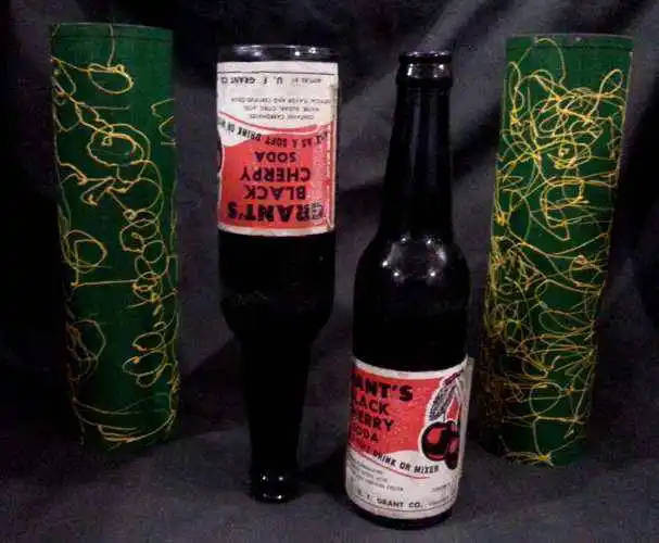
With a bottle of Coke or Pepsi, the bottle is instantly recognizable. Your audience knows it very well, and their brain can, essentially, dismiss it. It doesn't require a second thought.
"Grant's Black Cherry Soda," however, is something new. What's that? Never heard of it. This is new information for the brain. Your audience has to think about it. While they are thinking, they also need to think "is this real, is this dangerous, should I trust this bottle?"
This is the idea of ICONOGRAPHY. An icon is a shortcut for the brain. A simplified, instantly recognizable image to represent a more complex idea. You don't need to process all the details, because you've done this work previously. Your brain is able to access what it already knows about that icon and apply it in this new situation.
When a magician uses an object which seems familiar, they are relying on a sort of iconography to cause your brain to skip over any suspicious line of questioning.
When I re-design a prop to increase clarity, my goal is to make it as easy as possible for your brain to be lazy.
In Practice
I'll share a few examples of how I've focused on simple and clear design to increase the effective communication of a magic prop.
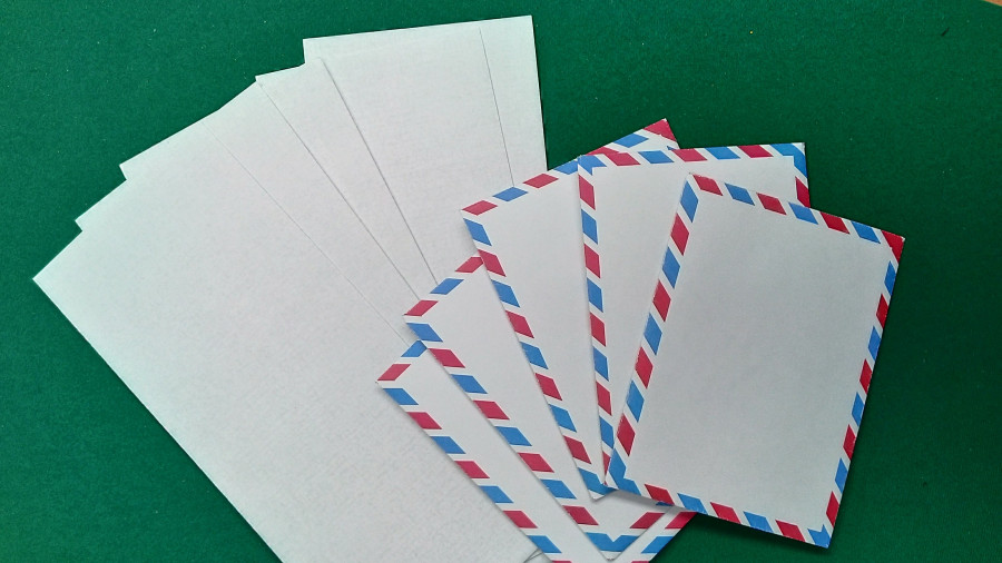
Envelope Borders
I created Ryanvelopes primarily for nefarious magical reasons, but along the way I got to design an envelope made for a stage presenter. Standard envelopes, from a distance, blend into a white blob.
In this picture you can see how the blue/red border pattern makes a stack of envelopes much more visible. Not only clearly defining what they are, but also how many.
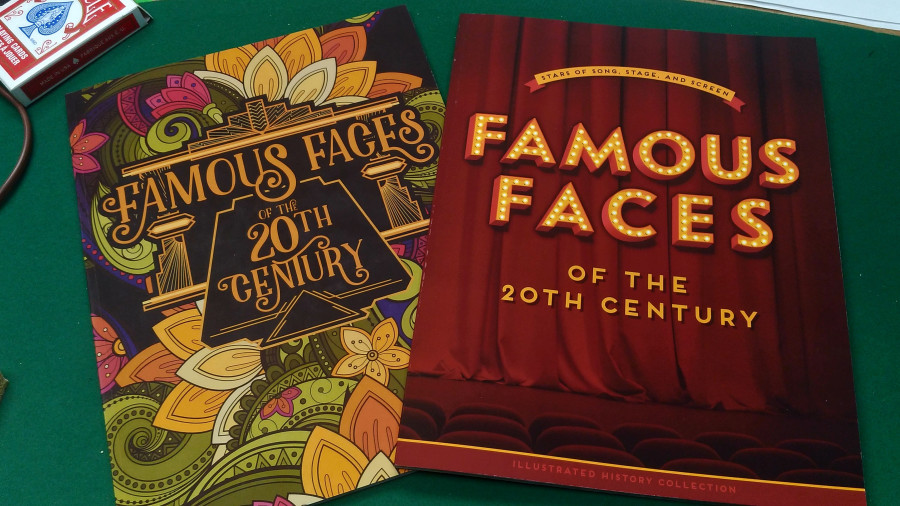
Book Covers
We magicians DO want people to judge a book by its cover. While I was happy with the normalness of the original design for my Famous Faces book, the new update is simply more visible, and readable, from a distance.
This could be taken too far. If it just said "FAMOUS FACES" in big block letters, it may be more visible, but it might look more like magic prop than a believable, real book.
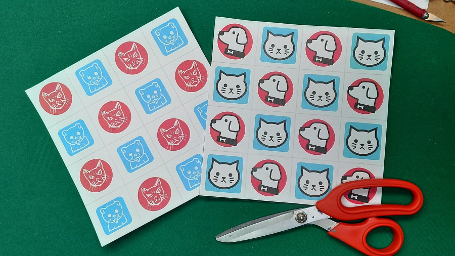
Cats & Dogs
I've been lecturing on the paper cutting stunt Bi-Kolor Kut and how it can inspire new presentations. One such idea is my Cats & Dogs Personality Test. I was recently called out on the fact that my first design (the original 5-minute prototype) is really hard to see any difference between the cat and dog images. Excellent point!
My update will hopefully make them much more distinct. I even chose a dog in profile to further contrast with the shape of a front-on cat.
It can be tough to notice your own lack of clarity. It's a bit like reading your own handwriting; of course it's clear to you, you already know what it says!
Feedback from friends and peers is fantastic, but you can also test this stuff out for yourself. Look at your act from a distance. Set your camera up at the back of the room. Watch on your phone instead of the big screen. (and watch with the sound off to focus on the visual) Keep an eye out for what could be made more clear.